Redesigning a healthcare app so reporting a symptom doesn't feel like solving a puzzle

Vivfy is a Colombian healthcare app for Spanish-speaking patients. I was brought in as the sole UX/UI designer to redesign the Android app, which is still in development.
My Role
/ UI UX Designer
Skills
Category
/ Mobile Redesign
Timeline & Status
/ Summer 2025
Context
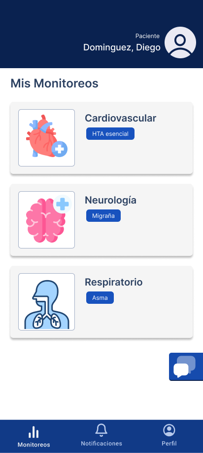
The original flows worked on paper, but patients had to stop and read everything instead of just recognizing it. Three different medical categories, one generic icon.
What I was given
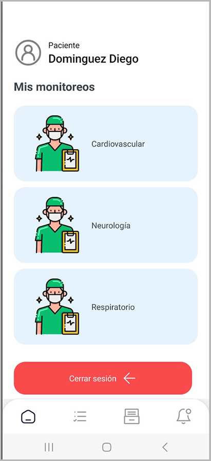
- All three monitoring categories look almost identical.
- No quick status signal before opening a card.
- Logout is visually dominant over health-tracking actions.
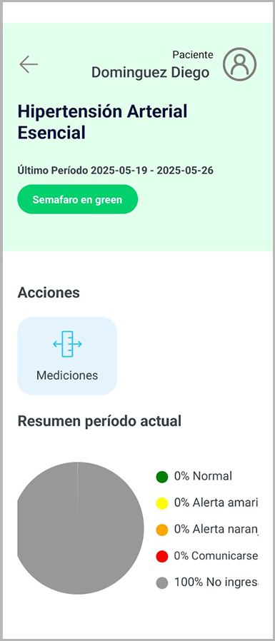
- Data visualization takes space without helping key decisions.
- Input and status states lack clear guidance for users.
- Inconsistent labels and hierarchy reduce confidence in the flow.
What I Did
Collaboration
I started with a series of meetings with the product owner to understand the problem, then looped in developers early to make sure decisions were feasible before committing to them.
Initial walkthrough of the current flowReviewed the existing experience and aligned on the core problem areas.
Follow-up alignment meeting after reviewConfirmed priorities, scope boundaries, and practical constraints before execution.
Prepared draft concepts and proposed directionDeveloped early high-fidelity drafts to communicate the recommended UX/UI approach.
Received approval to proceedStakeholders approved the direction and confirmed the implementation path.
Direction was positively receivedInitial feedback validated the proposal and supported continued iteration.
Research Signal
On the research side, most of my signal came from PO feedback. I also did an informal test with my grandmother - she's in the actual target age group - asking her to report a headache with no instructions. That was enough to confirm the original flow asked too much of users.
Design Decisions
From there the decisions were straightforward
Before & After
Before

After
Constraints
I was the only designer on the team with limited research and few available test users. I made judgment calls about where to spend effort and what to cut.
Takeaways and outcome
Saying no to "impressive" visuals is a real design skill. The pie chart looked smart but didn't help anyone decide anything - cutting it was the right call. Working solo pushed me to be intentional about what I prioritized and honest about what I couldn't fully validate.
The product owner moved forward with the redesign. Vivfy is still in active development, and these decisions are shaping how the product grows.
I created dedicated flows for three key areas-neurological, respiratory, and cardiovascular-each with its own way to report conditions and see progress.
Neurological
Respiratory
Cardiovascular